
Website Before and After
From Overlooked to Unforgettable: Rebranding Wheelhouse Event Solutions
Client Overview:
Wheelhouse Event Solutions is a full-service event production and strategy firm specializing in high-stakes fundraising events for nonprofits and mission-driven organizations. Led by founder Jess Frank — a 20-year veteran of experiential and nonprofit event production — Wheelhouse has produced some of the country's largest fundraising galas, 5Ks, peer-to-peer campaigns, and walks for clients ranging from the 9/11 Memorial & Museum to Susan G. Komen to Hospital for Special Surgery. The expertise was undeniable. The brand? It wasn't keeping up.
Challenges:
Wheelhouse came to VC5 with a brand that had aged out of relevance. The logo felt dated, the color palette lacked energy, and the website design didn't reflect the caliber of events Jess and her team were actually producing. Despite an extraordinary track record and glowing client testimonials, the digital presence was underselling the business at every turn. There was no clear messaging framework, no compelling narrative to help potential nonprofit clients understand why Wheelhouse was the right partner for their most important event of the year. The site wasn't converting — because it wasn't communicating.
Creative Approach:
We approached this as a full brand refresh built around one central truth: Wheelhouse doesn't just run events, they take the weight off the shoulders of nonprofits so they can focus on their mission, not the logistics. Every creative decision, from the visual identity to the copy, was made in service of that idea. The goal was a brand that felt energetic, trustworthy, and deeply human — exactly the qualities nonprofit leaders need to see before handing over their biggest fundraising moment of the year.
Key Components:
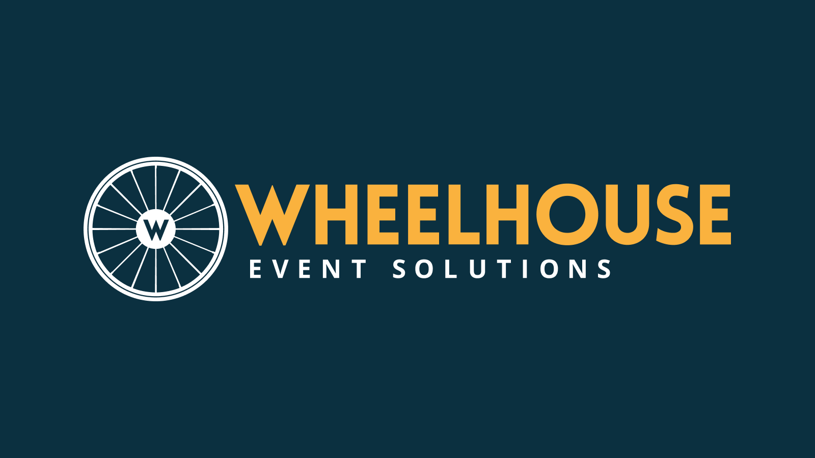
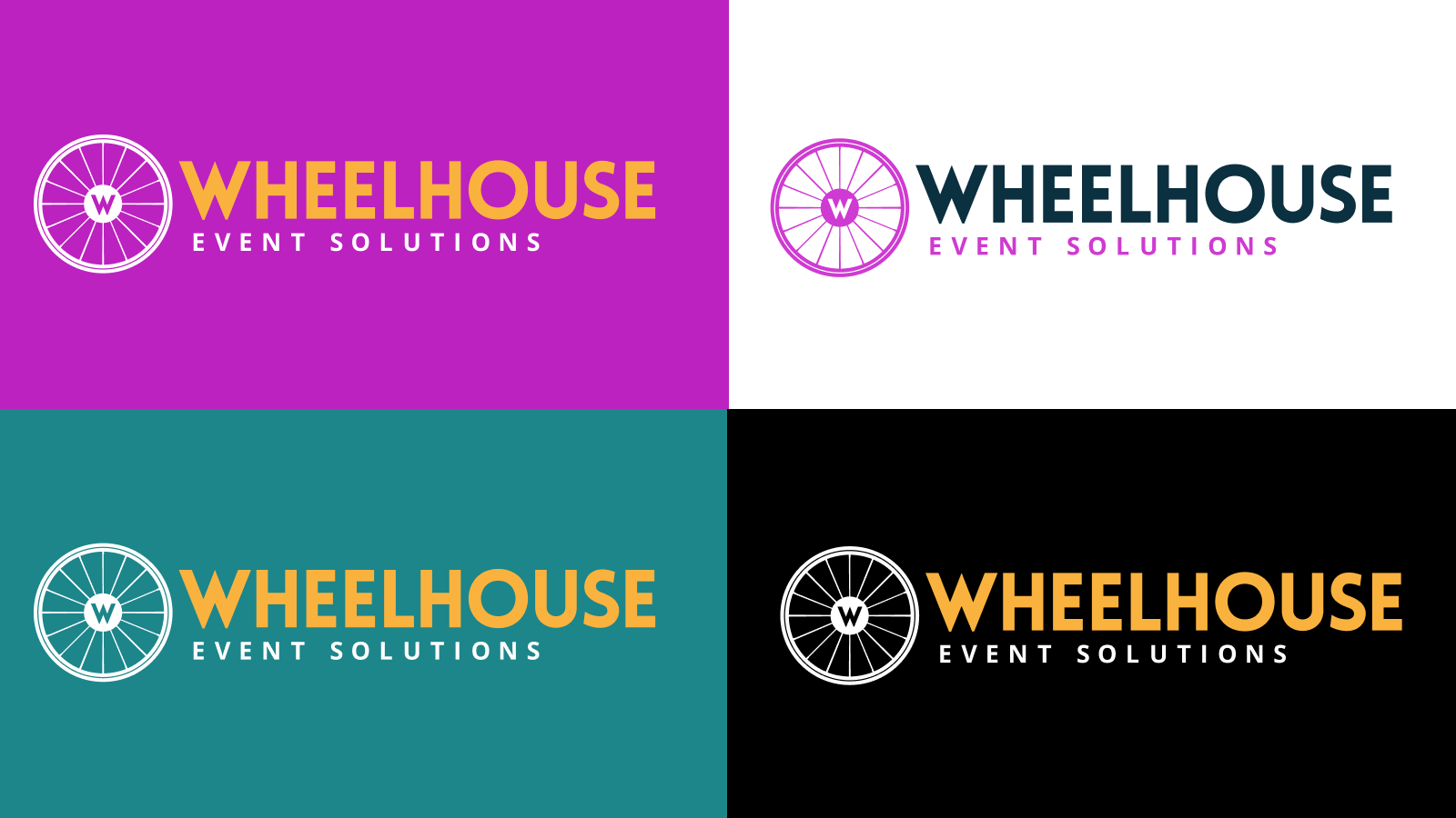
Logo & Visual Identity: We refined and modernized the Wheelhouse logo, creating a cleaner mark that retained brand equity while dramatically improving its professionalism and versatility. A bold new color palette — anchored by a signature yellow, gave the brand the warmth and energy that Jess's personality and events naturally bring to life. Typography and visual systems were established to ensure consistency across every touchpoint.
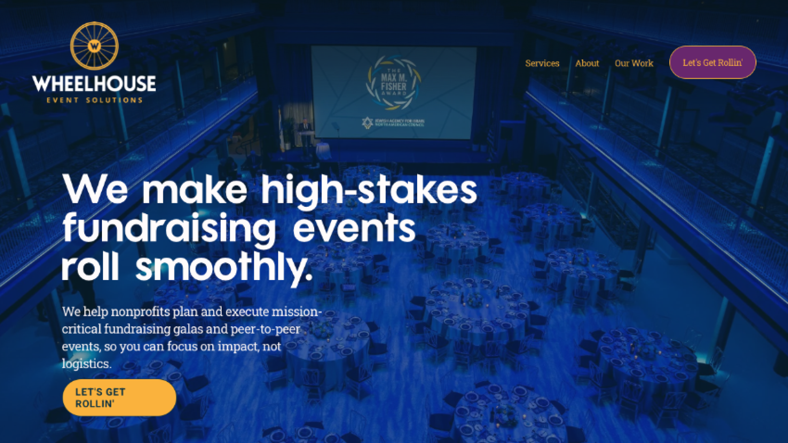
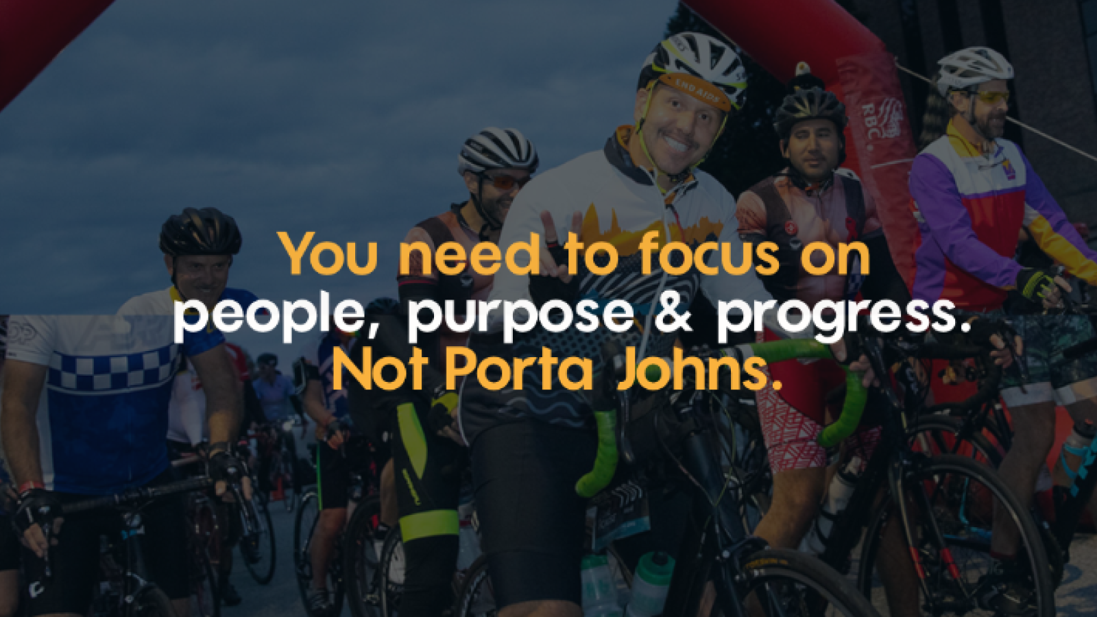
Messaging & Copy: Working from a deep understanding of the nonprofit audience, we developed a complete messaging platform for the brand. Headlines like "We make high-stakes fundraising events roll smoothly" and "You bring the mission. We'll bring the muscle." cut right to the emotional core of what Wheelhouse's clients actually need. Every word on the site was written to speak directly to overwhelmed nonprofit professionals who know their event matters and can't afford the wrong partner.
Website Design & Development: We designed and built a conversion-focused website that reflects the energy and professionalism of Wheelhouse's actual work. The new site guides visitors through a clear narrative arc, from identifying the problem (stretched staff, high stakes, no margin for error) to positioning Wheelhouse as the obvious solution. Client logos, powerful testimonials, and compelling calls to action work together to build trust and drive inquiries.
Results:
The new Wheelhouse brand shows up the way the work always has — with confidence, clarity, and heart. What was once a capable but visually underwhelming digital presence is now a brand that commands attention and earns trust before a single conversation takes place. Jess Frank's decades of experience and her roster of world-class nonprofit clients finally have a brand home worthy of both. The result is a business that looks exactly as good as it actually is.
See the new website at wheelhouseeventsolutions.com